Visualising point information to reveal development trends in Neath Port Talbot
The following video is attempting to visualising the first year of Pre-application advice by a local planning department. Yellow and Green areas represent 1 to 2 advisory incidences whereas the Red and Purple represents 3 or more. To do this with any point dataset you need to query your data into monthly breakdowns then save each month to a separate shapefile.
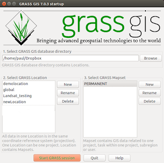
Use the 'v.neighbors' module in Grass GIS 6.4.1 (or from QGIS/Grass Plugin) to create a rasterised grid of each month then when the 12 months of data have been rasterised into one Grass View use the 'r.out.mpeg' module to export the 12 layers into one mpeg file. The final action is to use your favourite video editor to slow the movie frame rate down from around 30fps to around 5 to10fps. This video is a poor copy minus the legend showing the colour scheme and the months.
Use the 'v.neighbors' module in Grass GIS 6.4.1 (or from QGIS/Grass Plugin) to create a rasterised grid of each month then when the 12 months of data have been rasterised into one Grass View use the 'r.out.mpeg' module to export the 12 layers into one mpeg file. The final action is to use your favourite video editor to slow the movie frame rate down from around 30fps to around 5 to10fps. This video is a poor copy minus the legend showing the colour scheme and the months.


Comments
Post a Comment